- Daily Chartbook
- Posts
- Daily Chartbook #214
Daily Chartbook #214
Catch up on the day in 30 charts
Welcome back to Daily Chartbook: the day’s best charts & insights, curated.
1. Pricing power. "Here's a detailed look at which global sectors are enjoying higher demand and are able to hike prices, and which are seeing slumping demand and diminished bargaining power."

2. Cycle indicator. "Morgan Stanley's cycle indicator suggest that the expansion from the pandemic lows is now heading towards completion."

3. True financial conditions. "The index of 'true financial conditions'...which combines a number of monetary variables, looks alarming, with conditions barely easier than three months ago and at levels much tighter even than during the credit crisis in 2008."

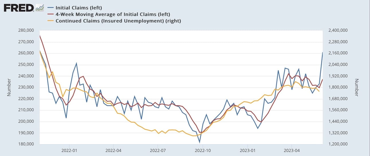
4. Jobless claims."Initial claims rose sharply last week, up 28,000 to 261,000 (an 18 month high). The 4 week average rose 7,500 to 237,250, still lower than its April peak. Continuing claims, with a one week delay, declined -37,000 to 1.757 million."

5. Household net worth. "Household net worth increased by $3.026 trillion in 1Q23 (largest increase since 4Q21), up from $1.619 trillion gain in prior quarter (revised down considerably from $2.927 trillion)."

6. TGA rebuild. "The [US Treasury] still has to boost debt sales duly to rebuild the TGA by the end of June. So far, only $40bn was raised for the TGA. Excluding refinancing, today's auctions might raise an extra $1bn. That's short of the $120bn/w it should raise weekly."

7. TGA vs. USD. "Historically, the rebuild of the Treasury General Account (TGA) has had little effect on the US dollar."

8. 2s10s curve. "While we expect the 2s10s UST curve to steepen, it is likely to remain inverted for longer than market forwards imply."

9. Gold flows. "Gold prices are holding up even though global money flows into physical gold ETF products are quite sluggish. That’s bullish, although it suggests that there is no immediate catalyst for the yellow metal."

10. Risk demand. "Global risk demand is back to its previous highs…Yet everyone says they are 'bearish' in surveys."

11. Global tech flows. "Last week, Global tech funds logged +$8.547B worth of inflows, this was the largest weekly inflow on record."

12. Downside protection. Yesterday saw a record 2.4 million QQQ puts traded while open interest approaches all-time highs.

13. VIX options. "VIX daily options volume is the highest since March 2020. $VIX is also at 13.6, lowest since Feb 2020."

14. SPX shorts vs. money market funds. "The short S&P500 futures positions are even more dramatic than during the Great Financial Crisis. Combined with all that cash sitting in Money Market funds."

15. Individual investor sentiment. "AAII bull-bear spread soars to highest level since Nov 2021 as bulls (44.5) > bears (24.3) for the first time in 16 weeks."

See:
16. Active managers. The NAAIM Exposure Index shot up to 90 from 54 and is at its highest since November 2021.

17. Hedge fund positioning (I). "Net exposures particularly elevated in Info Tech (97th percentile), Consumer Discretionary (96th percentile), Health Care (92nd percentile), and Consumer Staples (98th percentile)."

18. Hedge fund positioning (II). "Sector net exposures are at or near one -year lows for Energy (1st percentile), Materials (3rd percentile), and Financials (5th percentile)."

19. CTAs vs. equities."CTA Positioning is US Equities is now at the highest level since January 17th, 2022."

20. Equal weight inflows. "So far this week, more than $1 billion has flooded into the $35 billion Invesco S&P 500 Equal Weight ETF (ticker RSP). That’s on track to be the biggest weekly inflow in RSP’s 20-year history."

21. SPX breadth. "Dramatic improvement in breadth. % of S&P 500 stocks above their 200-day goes from 38% to 53% in four trading sessions. Following Mega-Cap Divergences, breadth is key to the market's next move."

22. Overbought small-caps. "The small-cap Russell 2,000 closed at its most overbought level relative to its 50-DMA in its history yesterday at 3.7 standard deviations above. Prior high was in January 1991."

23. Small- vs large-cap. "The disconnect between small and large-cap indexes is one of the most significant in history. For only the 6th time in 40 years, the distance from a 2-year high spread between the Russell 2000 and the S&P 500 widened to 15%."

24. EPS vs. profits. "The S&P 500 reported earnings are too high relative to economy-wide profits."

25. Forward PE. "SPX P/E excluding Big Tech is much closer to the median levels than the headline index."

26. Forward EPS growth. "Huge gap has opened between YTD forward EPS growth for NASDAQ 100 (blue) and Russell 2000 (orange), with former up by 6% and latter down by 10%."

27. PEG ratio. "This ratio is now at levels last seen during the height of the Dot Com bubble."

28. Multiple expansion. "We know from past market cycles that stocks tend to bottom well ahead of earnings, which by definition means that the first few quarters of a new bull market tend to be driven by multiple-expansion. We can see that below."

29. Drawdown probability. "Our S&P 500 risk model has surged from 'low' risk to 'high' risk. Reminder: This model only considers downside risk and represents the probability of a +10% drawdown over the next month."

30. BTFD. And finally “buy-the-dip strategies are having one of their best years ever, as equity investors remain most concerned about the upside.”

Have a great weekend!
Reply